
NBA DRAFT 2015
Since we now have some more recent and context relevant data from the NBA Summer League, what I have here might not mean as much now as it did before the Draft when we were left with nothing but college stats to project future NBA production. But here goes anyway.
Data Set, Source and Explanation:
All stats from Sports-Reference’s College Basketball section
Sample Size: Prospects drafted by an NBA franchise from 2010-2015 and played significant time* against NCAA competition. Stats are taken only from the player’s most recent college season**
*Significant time is a slightly subjective term to describe what I considered a relevant and large enough sample size. For instance Chris McCullough only played 16 games as a freshman at Syracuse (13 non-conference, 3 ACC games). Due to the limited competition and small sample size on this fist pass through this process I decided to exclude his, and similar seasons, from the raw data.
**The reasoning for not including the entire college body of work is to exclude earlier stats for the sake of relevance and recency. Many times prior stats were accumulated in a vastly different, often a more limited, role. Taking into account only the most recent season will hopefully screen out gaudy per possession stats generated in an ancillary role as well as give us a snapshot of the player’s current production.
SPOILER ALERT: The analysis and conclusions drawn are sloppy…on purpose. You’ll see why
USG% vs PER

This chart is interesting to me. You would certainly expect that as a player’s usage increases, his efficiency decreases. It makes sense right? Its easier to maintain a high efficiency if you’re not asked to repeat that success on a repeated basis. Another less obvious factor is that if your usage is lower, you are likely not a top offensive option meaning you probably also benefit from the attention those better (theoretically at least) offensive options draw.
So why is this graph suggesting that as USG% increases so does PER?
Well, there are a few possibilities. Maybe our original assumption was false. Or maybe PER doesn’t measure efficiency well and/or USG% is not an effective measure of usage. Maybe both?
For the record PER stands for Player Efficiency Rating and was developed by John Hollinger, now of ESPN. There has been much debate about how effective a measure of overall quality it is, but most would assume its designed to measure efficiency because, you know, it has that in the name. A full explanation from Hollinger of what PER is and how its calculated is here. A criticism contesting it gives too much credit to high volume production and therefore is a poor estimate of efficiency is here. You decide.
Now lets take a look at a similar data set that uses Offensive Rating (originally developed by Dean Oliver) instead of PER. An explanation of O Rtg (a common abbreviation) is in Oliver’s great book “Basketball on Paper” but Sports-Reference takes a stab at it here.

Now let’s take a look at these graphs with trend lines.

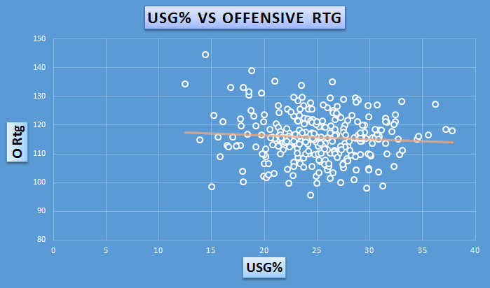
It’s dangerous to judge the effectiveness of a metric on a limited and very subjective opinion. Nonetheless it seems that Offensive Rating fits our assumption a little better. Does that mean its more accurate? Certainly not, but its quite interesting if you ask me.
It’s also important to note that this data is not by any means the best way to evaluate these metrics in a general sense. They are specific to a 6 year window and limited to one season of college production. But, they might help us answer some questions or at least visualize them. What’s key is to use any data or representations of them wisely and don’t make assumptions or extrapolate recklessly.
So with that in mind I think what we can say is the truth in our assumption (that increase in usage means a decrease in production) depends on your definition of efficiency and whether or not you think PER or O Rtg accurately measures it. That’s because one suggests that assumption is true and the other suggests its not.
Now for the REAL analysis. When I first drew up these charts I made some hasty assumptions without thinking about what was actually being measured. Philip Mudd cautions against doing this in his book “The Head Game”. In it he stresses the importance of avoiding the temptation to dive right into the data and, therefore, waste time or worse distort you judgement by not having a clear goal or plan in place to shape your efforts.
In an effort to increase the effectiveness of any analysis of this issue, I’ll fully address this in another article, but will venture to say the following:
What we were really looking at was not how a player’s efficiency changes based on usage. To do that you’d have to examine an individual player’s usage and efficiency relationship over the course of some period of time. What I did above was just plot a group of draftees usage and efficiency and try to find a trend. So really there is a better way to visualize and assess the prior question. I’ll do my best with the available data, stay tuned.
SO, WHAT DOES THIS MEAN?
In short, its easy to draw conclusions from data and particularly pretty pictures and charts without properly scrutinizing their accuracy or scope.
So, the charts DO NOT say:
– The more a player is involved in the offense (higher usage %) the more or less efficient he becomes. That conclusion would have to be drawn from player specific data.
What the charts MIGHT SAY:
– High level college basketball players who have higher usage ratings tend to be more involved in the offense for a reason. The reason being they are really good.
Quick Notes:
- From the data set we can see that as we look at players with higher and higher usage percentages, we tend to see the PER increase
- This does not effectively answer whether or not we can expect a player’s efficiency to decrease with increased usage
- There is one really interesting possible explanation for our findings:Players with higher usage rates in college tend to be better players and therefore be more effective at all the activities that contribute to PER. For example, maybe its PER that actually drives usage rate. So maybe Cameron Payne has a relatively high usage rate (31.5%) because the Murray State coaching staff knows he’s the team best player and expect a high efficiency rating (PER 30.1) regardless of usage.
- From the data set we can see that as we look at players with higher and higher usage percentages, we tend to see the Offensive Rating decrease
- This does not effectively answer whether or not we can expect a player’s efficiency to decrease with increased usage
- There is one really interesting possible explanation for these findings:Offensive rating and PER measure two vastly different things. We’d expect both to attempt to answer the same question about overall offensive efficiency, but maybe that’s not the reality.
- Another possible explanation is that, as some people have speculated, PER tends to “overvalue” volume, meaning the metric gives too much weight or credit to points scored and doesn’t properly value how efficiently those points are scored. That conclusion is not for me to validate, especially with this admittedly incomplete data set, but is one that others have advocated for before.
